Planning an autumn gathering at home this year means choosing a palette that will actually feel current when your guests walk through the door, not one that peaked two seasons ago. Fall 2026's color story pulls from several converging sources: the runway-driven forecasts released by Pantone, the paint industry's annual Color of the Year selections, and the wedding and event design world's own read on what hosts are gravitating toward. Line these reports up side by side and a clear, cohesive direction for home entertaining emerges.
This guide breaks down where those trends come from, what they mean in practical terms for a private residence event, and how to translate a runway or paint-chip color into something that works on a table, in a room, or across an outdoor setup. We've organized it the way we'd walk a host through the decision ourselves, starting with the big-picture forecasts, narrowing into event-specific palettes, and ending with the practical calls you'll actually need to make.
Why Fall 2026's Palette Feels Different This Year
Color forecasting isn't guesswork. It's built from consumer research, retail sell-through data, and runway analysis conducted months (sometimes a year) ahead of the season. The Pantone Color Institute's Fashion Color Trend Report for New York Fashion Week Fall 2026 is one of the most closely watched of these forecasts, and its executive director summed up the driving sentiment simply: shoppers and designers alike are "seeking wearable colors with true versatility, while simultaneously reaching for color that injects energy, surprise, and spontaneity" (Marie Claire).
That tension, grounded neutrals balanced against unexpected pops, is the throughline running across every report referenced in this guide, and it's exactly the kind of balance that translates well to home entertaining, where a room needs to feel warm and livable rather than like a themed stage set.
The Ten Colors Anchoring Fall 2026
Pantone's Fall 2026 report identified ten colors expected to dominate the season (Marie Claire; WWD):
Muted Clay: a dusty, beige-pink neutral
Neptune Green: an aquatic blend between blue and green
Green Envy: a calmer, more demure green
Arabian Spice: a tangy, purplish-red
Foxglove: a romantic lilac-pink
Festival Fuchsia: a saturated, high-energy pink
Red Mahogany: cherry red blended with chocolate brown
Acacia: a golden yellow succeeding last year's butter-yellow moment
All Aboard: a coastal, maritime blue
Burnt Olive: a dark, sophisticated green
For home entertaining, the standouts are the ones with enough depth to hold up under evening lighting. Red Mahogany, Burnt Olive, Arabian Spice, and Muted Clay are the four we'd point a host toward first, since they read as rich rather than trendy for trendy's sake.
The Official Word: 2026 Color of the Year Roundup
Runway forecasts move fast, but the paint industry's Color of the Year picks tend to have more staying power, since they're chosen with interiors in mind rather than garments. Several major brands' 2026 selections lean directly into the same warm, grounded territory (Young House Love):
Brand | Color | Description |
|---|---|---|
Benjamin Moore | Silhouette | Burnt umber with notes of charcoal |
Sherwin-Williams | Universal Khaki | Warm, earthy neutral |
Behr | Hidden Gem | Smokey jade |
Glidden | Warm Mahogany | Rich, grounded red |
Dunn-Edwards | Midnight Garden | Deep, muted green |
Minwax | Special Walnut | Rustic wood stain tone |
Graham & Brown | Divine Damson | Deep, saturated purple |
Notice how closely these interior picks echo the runway palette above: Warm Mahogany and Red Mahogany, Midnight Garden and Burnt Olive, Universal Khaki and Muted Clay. When fashion forecasting and interior color-of-the-year selections converge this tightly, it's a strong signal that a palette has real cross-category momentum rather than being a one-season fashion blip.
What the Event World Is Doing With It
Wedding and private-event designers are often the fastest to translate a color forecast into an actual room, because they're building full environments (table linens, florals, lighting) rather than a single garment. Two 2026 palette forecasts stand out for fall entertaining.
Deep Plum, Burgundy and Rose Gold
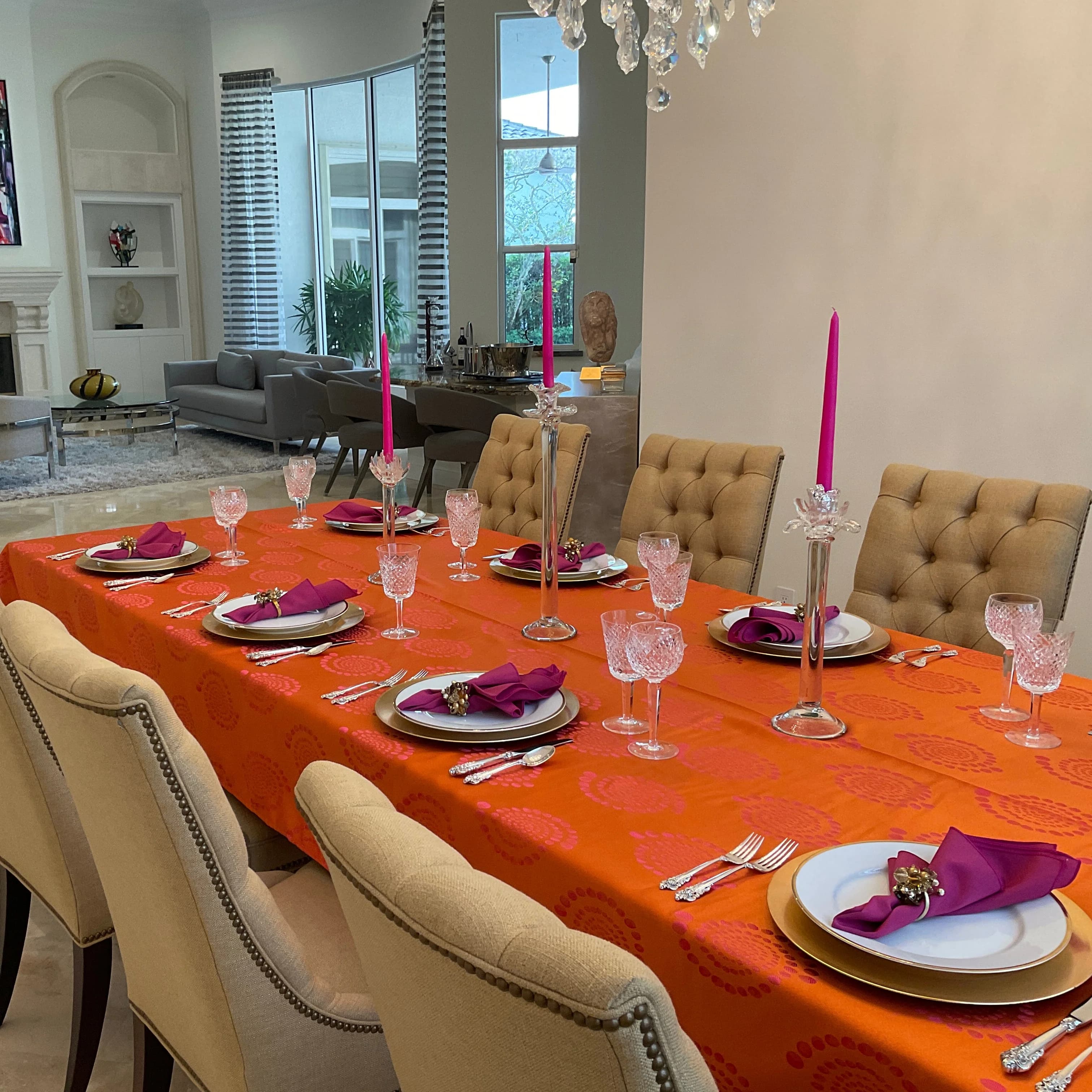
Described by wedding planning platform Paperlust as "moody, jewel-toned, and romantically dramatic," this combination is being called the season's signature palette. Deep plum and burgundy anchor the space while rose gold accents keep it from feeling too heavy (Paperlust).
Forest Green, Deep Ivory and Copper
A lusher, nature-forward option that reads as more layered and grounded than the sage-green palettes that dominated the past few seasons, with copper accents adding warmth under candlelight (Paperlust).
Terracotta, Rust and Cream
An earthy, Southwest-inspired combination with genuine harvest-season warmth. It's a good option for a host who wants "fall" to read immediately without leaning on orange-and-brown cliché (Paperlust).
Beyond Color: Two Structural Shifts Worth Knowing About
Color isn't the only thing changing this season, and both of these shifts affect how you'll want to plan a tablescape or room layout.
Silver Is Overtaking Gold as the Metallic of Choice
After several years of warm gold dominating event design, 2026 is seeing a real pivot toward silver: sleeker, more modern, and notably good under candlelight, according to event design analysis from Reverie Social (Reverie Social). If you're layering flatware, votives, or frame accents into your event, this is worth factoring in before you commit to a metallic finish.
Texture Is Being Treated as the New Focal Point
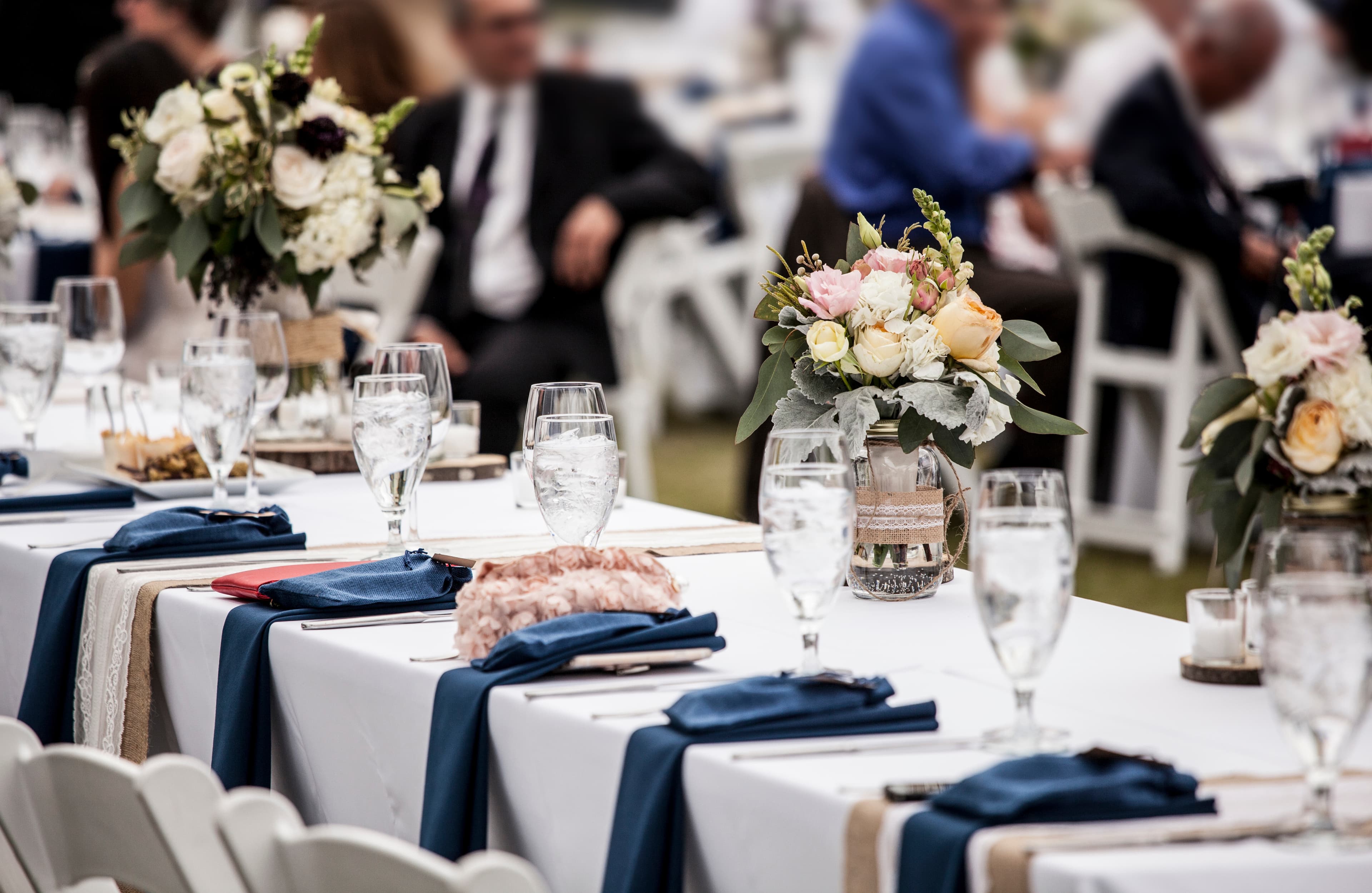
Perhaps the most useful trend for anyone planning a home event is that designers are increasingly treating texture, not just color, as the primary design layer. One designer quoted in the Reverie Social report put it directly: "linens are the new florals." Velvets, bouclé, and layered textiles are being used to build dimensional tablescapes that don't rely on a single statement centerpiece to carry the room (Reverie Social).
That's genuinely good news for private residence entertaining. Texture and layering are far more forgiving, and far more reusable across future events, than a single trend color you might tire of.
How to Choose a Palette for Your Own Event
A few practical principles, drawn from watching how these seasonal trends actually play out in real rooms:
Anchor with one deep, saturated tone. Whether that's Red Mahogany, deep plum, or forest green, pick one color to do the heavy lifting on your table or in your linens, then let everything else (florals, place settings, lighting) support it rather than compete with it.
Let a neutral do the balancing. Muted Clay, deep ivory, or cream keep a jewel-toned or earthy palette from feeling like a costume. This is the "wearable versatility" Pantone's own report points to. The same logic that works on a runway works on a dinner table.
Use metallics sparingly and intentionally. If you're leaning into the silver trend, commit to it across flatware, candle holders, and accents rather than mixing warm and cool metallics in the same sightline.
Think in texture before you think in decor pieces. A layered linen approach, with a textured base layer under a contrasting overlay or runner, does more visual work than an additional centerpiece, and it travels well from a formal dinner to a more relaxed backyard gathering.
Frequently Asked Questions
Will these fall 2026 colors still feel current for a late-season event, like a December gathering? Yes. Several of these palettes overlap with paint-industry Color of the Year selections, which are chosen for year-round interior relevance rather than single-season runway use. Tones like Red Mahogany, Universal Khaki, and Midnight Garden are built to carry from early fall into winter entertaining without feeling dated.
Is jewel-toned styling only appropriate for formal events, or can it work for a casual home gathering? Jewel tones scale down easily. The key is dosage. A full room saturated in deep plum reads formal, while a single jewel-toned runner or set of napkins against a neutral table reads current without feeling overdone for a casual dinner or family gathering.
How do I avoid my fall palette looking like "generic autumn" (orange, brown, rust) instead of intentionally on-trend? Lean on the more unexpected notes in this season's forecasts, such as Neptune Green, Foxglove, or Arabian Spice, as accent tones against a grounded neutral base like Muted Clay or deep ivory. The 2026 story is about depth and unexpected combinations, not a straight orange-and-brown palette.
Will silver metallics look dated quickly if the trend shifts back to gold? Metallic trends tend to cycle over several years, not seasons, so a silver investment made for fall 2026 should have a reasonable multi-year runway. If you want to hedge, choose a warm-toned silver, sometimes called "champagne silver," that sits between the two trends.
What's the most future-proof color choice if I only want to invest in one statement piece this season? Based on how closely the runway and paint-industry forecasts overlap this year, a deep mahogany or burgundy red is the safest long-term investment. It appears across multiple independent 2026 forecasts, which suggests it has staying power beyond a single trend cycle.
How might these trends evolve into 2027, and should that affect what I buy now? Color forecasting typically shows gradual evolution rather than sharp pivots, so this year's grounded neutrals paired with jewel accents are more likely to soften slightly than reverse outright. Investing now in a versatile neutral base, like a deep ivory or muted clay linen, with swappable jewel-toned accent pieces gives you the most flexibility as the palette shifts.